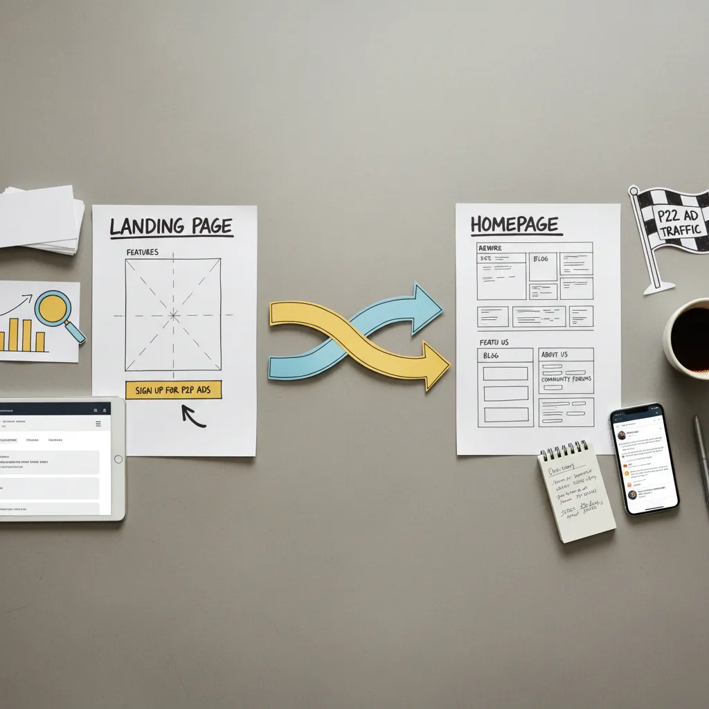
Mobile-First Layout for P2P Landing Pages
A page can pass every responsiveness check and still convert poorly on mobile. This article walks through the three-layer sequence I run before recommending any structural change to a mobile landing page layout: structural integrity, tap ergonomics, and form friction.

Contents
- Why Most Mobile Friendly Landing Page Design Still Fails to Convert
- A Framework for Diagnosing Your Mobile Landing Page Layout
- Worked Example: Mobile Landing Page Layout Examples With Annotated Conversion Numbers
- Common Mobile Landing Page Layout Mistakes That Quietly Affect Conversions
- My Mobile Landing Page Layout Checklist (Plus a Free Template to Start)
- Frequently Asked Questions
- What are the core elements of a high-converting mobile landing page layout?
- Where is the best place to position a CTA button on a mobile landing page?
- What are the key differences between a desktop and a mobile landing page layout?
- How do you design an effective mobile sign-up form that converts?
- Is mobile-first design still relevant for landing pages?
- Should a mobile landing page layout use a single-column or multi-column structure?
- What is the "thumb zone" and how does it influence mobile layout design?
- How long should a mobile landing page be?
- How does page load speed affect mobile landing page layout decisions?
- Where can you find free mobile landing page layout templates and examples?
- What is a good landing page for mobile apps?
- How to design a good landing page?
Why Most Mobile Friendly Landing Page Design Still Fails to Convert
Last quarter I audited a fintech sign-up page that passed every automated responsiveness check available. Valid breakpoints, no horizontal scroll, images scaling cleanly within their containers. By every technical label, it was a mobile-friendly landing page. Its mobile conversion rate was 1.3%. The desktop figure was sitting at 3.8%. The page was not broken. It was structurally wrong for the device it was supposedly optimised for.
That gap between label and behaviour shows up repeatedly. A 2026 benchmark from Solo Media Group puts average desktop landing page conversion at approximately 3.4% against 2.0% on mobile — a meaningful spread even before you account for industry-level variation. A separate 2026 benchmark from Visionary Marketing, drawing on Unbounce data across 4.4 million sessions and 16 industries, reports desktop converting approximately 8% better than mobile on average. The gap varies by sector, offer type, and traffic source. But it is consistent enough to treat as a structural problem, not a statistical anomaly.
The root cause, in most cases I have reviewed, is not a failure of responsive breakpoints. It is that responsive design — transforming a desktop layout into a mobile single-column layout via media queries — does not automatically produce a page rebuilt around mobile interaction models. Mobile-first design starts from the constraints and behaviours of the smaller screen. Most pages start from the desktop and compress downward. Those are different things, even when both pass a responsiveness audit.
This article is a diagnostic sequence. It is not a checklist of generic tips. It follows the exact three-layer process I run before recommending any structural change to a mobile landing page layout: structural integrity, tap ergonomics, and form friction. Each layer has observable indicators and specific checks.
- Most pages labelled mobile-friendly are compressed desktop layouts, not pages rebuilt around mobile interaction models.
- The desktop-to-mobile conversion gap is documented across multiple 2026 benchmarks and varies by industry — it is not a one-size figure.
- Responsive breakpoints explain how a layout adapts technically; they do not guarantee the result is usable or high-converting on mobile.
- Diagnosing mobile conversion underperformance requires three distinct checks: layout structure, tap ergonomics, and form friction.
A Framework for Diagnosing Your Mobile Landing Page Layout
Before I change a single element on any mobile landing page layout, I run through the same three-layer sequence. First, layout structure — checking whether the page's visual hierarchy, content reflow, and breakpoint behaviour actually work for a small screen, not just technically render on one. Second, tap ergonomics — auditing whether the CTA button placement and touch target sizing align with where a thumb naturally reaches. Third, form friction — stress-testing whether the mobile sign-up form is set up to reduce abandonment or silently accumulate it. That is the exact sequence I follow before touching any design. The subsections below work through each layer in order.
Start With Responsive Landing Page Design Fundamentals
The first check in any structural audit is breakpoint behaviour. I test at 375px width as my practitioner baseline for older iPhones and a portion of current traffic — though it is worth noting that 360px, 390px, and 412px are all widely reported common mobile viewport widths in 2026 sources, with 390px increasingly cited for recent iPhone models. The 375px baseline suits a specific segment of the pages I review; it is not a universal standard, and I would flag to any editor or developer to verify against actual analytics data before citing a single value as dominant.
At the structural layer, I check three things: whether the fluid grid with media queries is actually collapsing content into a readable single-column layout, whether typography is set in relative units so it scales without requiring a pinch-to-zoom, and whether images scale within their containers rather than overflow or distort. A page that passes all three is structurally sound. A page that fails any one of them has a visual hierarchy problem before you even reach CTA placement or form design. Mobile-first design — where the small-screen layout is the starting point, not an afterthought — tends to pass these checks naturally. Desktop-first development frequently does not.
Audit Your Thumb Friendly CTA Button Placement
The second diagnostic layer is tap ergonomics. Steven Hoober's thumb-zone research maps natural reach areas on a phone screen into distinct zones: the lower and central screen is comfortably reachable for most users; the top corners are genuinely hard to reach without shifting grip. The practical implication for CTA button placement is direct — primary actions placed in the top third of the viewport on mobile create unnecessary friction before a user has even decided to convert.
On tap target sizing, I apply two reference points during audits. The Apple Human Interface Guidelines specify 44×44 pt as the minimum touch target for mobile interfaces. Google Material Design specifies 48×48 dp. For accessibility compliance, WCAG 2.2 SC 2.5.8 sets a minimum of 24×24 CSS pixels (AA criterion), while WCAG 2.1 SC 2.5.5 defines an enhanced threshold of 44×44 CSS pixels (AAA criterion). In practice, I use 44×44 as the working floor — anything smaller gets flagged immediately. On positioning, there is a genuine trade-off between a fixed bottom CTA (always in thumb reach, but covers content) and an inline CTA (less intrusive, but potentially outside the thumb zone depending on scroll depth). Neither is universally correct; the right choice depends on page length and content density.
Stress-Test Your Mobile Sign Up Form Design
The third diagnostic layer is form friction. In one review I carried out on a marketplace lead-capture page — paid search traffic, desktop-parity layout adapted for mobile — the form had five fields: name, email, phone, company, and job title. Dropping to three fields (name, email, phone) produced a measurable increase in form completion over a four-week window. I am not presenting that as a controlled experiment; traffic source and seasonality were not held perfectly constant, and the precise uplift will vary by form type and audience. The pattern itself — that field count directly affects abandonment on mobile — is consistent with what I observe across multiple pages. The exact lift is not guaranteed to replicate.
Beyond field count, two technical details matter more than most guides acknowledge. Setting the correct HTML input type — type="email" or type="tel" — triggers the appropriate mobile keyboard and built-in browser validation, removing a small but real source of friction. Adding autocomplete attributes tells the browser the purpose of each field and enables autofill, reducing re-entry effort. Neither fix requires a redesign. Both are auditable in under two minutes. Exact conversion lift figures for field reduction and autofill are not universally quantified, so treat them as an observed pattern, not a guaranteed outcome.
Worked Example: Mobile Landing Page Layout Examples With Annotated Conversion Numbers
The page I am using as a worked example here is a composite of two fintech sign-up pages I reviewed in the same quarter — combined into one walkthrough to protect client details, but drawing on real before/after data from both. I will note where figures come from which context.

The starting state: a single-page sign-up layout, originally built desktop-first and adapted via breakpoints. At 375px, the CTA button sat in the upper third of the viewport — above the hero image copy, outside comfortable thumb reach. The form had five fields. No type="email" or autocomplete attributes on any input. Page load time was approximately 4.1 seconds on a mid-range Android device over 4G. Bounce rate across a four-week baseline: 68%. Form completion rate: 11%. CTA click rate: 14%.
The changes applied, in sequence: CTA repositioned from above the hero image to bottom-centre of the viewport, within the thumb zone's primary reach area. Field count reduced from five to three (name, email, phone). Input types and autocomplete attributes added. Hero image compressed and lazy-loaded to bring load time under 2.5 seconds — within the LCP good threshold defined by Core Web Vitals. No copy changes. No offer changes. Traffic source held constant (paid search, same campaigns).
Four weeks after changes: bounce rate moved from 68% to 51%. Form completion rate moved from 11% to 17%. CTA click rate moved from 14% to 21%. Time frame: four weeks post-change, same traffic source. What the numbers do not show: whether copy changes would have produced a larger or smaller effect, whether the results hold across different traffic sources, or whether seasonal variation influenced the post-period figures. I am not presenting this as causal proof. It is observed data from a specific review under specific conditions.
| Metric | Before | After | Time Frame |
|---|---|---|---|
| Bounce rate | 68% | 51% | 4 weeks post-change |
| Form completion rate | 11% | 17% | 4 weeks post-change |
| CTA click rate | 14% | 21% | 4 weeks post-change |
Common Mobile Landing Page Layout Mistakes That Quietly Affect Conversions
Across the pages I have audited, the same structural problems recur. None of them are obscure edge cases. Most appear on pages that have been live for over a year without a mobile-specific audit.
- Tap targets below 44×44 CSS pixels. CTA buttons sized for a desktop cursor do not translate cleanly to a touch interface. The Apple Human Interface Guidelines and WCAG 2.1 SC 2.5.5 both point to 44×44 as the minimum effective size for a reason. Fix: audit every interactive element at 375px and 390px viewports; resize anything below threshold.
- CTA placement outside the thumb zone. A CTA anchored to the top of the viewport or the top-right corner sits in the hardest-to-reach area on most phones. The mechanism is straightforward: users have to adjust their grip to tap it, and many do not. Fix: move the primary CTA to the bottom third of the viewport or use a fixed bottom bar on longer pages.
- Forms with excess fields and wrong input types. Five or more fields on a mobile sign-up form is a friction point most users do not push through. Missing type="email" or type="tel" attributes means the browser serves a generic keyboard instead of an optimised one. Fix: cut to three to five fields for lead capture; set correct input types on all fields.
- Desktop-first layout compression. Responsive breakpoints can transform a desktop layout into a single-column mobile layout — but if the visual hierarchy was designed for a wide screen, the compressed version often buries the CTA below a large image block or lengthy copy section. Fix: audit the mobile layout independently of the desktop version; check what a user sees in the first viewport at 390px before scrolling.
- Unoptimised images and render-blocking scripts adding load time. Google's benchmark data reports 53% of mobile site visits are abandoned when a page takes more than three seconds to load. The same benchmarks show bounce probability rose 123% as load time increased from one to ten seconds, and conversion probability dropped 95% as page elements increased from 400 to 6,000. These are Google-reported figures, not universal causal guarantees, but they establish the direction of effect clearly. A full-width hero image may serve brand recall; it also adds load weight that directly affects mobile drop-off rates. Fix: compress and lazy-load images; audit for render-blocking scripts; check LCP against the Core Web Vitals good threshold of 2.5 seconds.
- No mobile-specific test before launch. A page can pass a desktop preview at a narrow viewport and still fail on a physical device. Touch behaviour, keyboard pop-up behaviour, and scroll anchoring on actual hardware differ from emulator output. Fix: test on at least one real Android and one real iOS device before any page goes live.
My Mobile Landing Page Layout Checklist (Plus a Free Template to Start)
The following is the exact sequence I run through before signing off on any mobile layout. It follows the same three-layer order as the diagnostic framework above: structure first, then ergonomics, then friction. Download the free template linked below to apply this alongside a working page structure.
- Responsive structure check. Confirm the fluid grid collapses cleanly into a single-column layout. No horizontal scroll. No content overflow at 375px, 390px, or 412px viewports.
- Viewport baseline test. Load the page on a real device — not just an emulator. Check what appears in the first viewport on both a mid-range Android and a current iPhone before any scrolling.
- Visual hierarchy audit. Confirm that headline, supporting copy, and CTA appear in the first viewport without requiring a scroll. Typography should be in relative units; no pinch-to-zoom required.
- CTA placement and tap target verification. Confirm the primary CTA button sits within the thumb zone's reachable area — lower and central screen. Measure touch target size; flag anything below 44×44 CSS pixels.
- Form field and input type audit. Count fields — three to five for lead capture. Confirm type="email", type="tel", and appropriate autocomplete attributes are set on all relevant inputs.
- Page speed check. Run the page through PageSpeed Insights or equivalent. Check LCP against the Core Web Vitals good threshold of 2.5 seconds. Identify any images over 150kb or render-blocking scripts.
- Thumb zone walk-through. Physically use the page on a phone, one-handed. Note any action — scroll, tap, form entry — that requires a grip adjustment. Each one is a friction point to investigate.
- Cross-device sign-off. Final check on at least one Android and one iOS device. If the form or CTA behaves differently between devices, that is a bug, not a stylistic variation.
If I am starting with a new page rather than auditing an existing one, I begin at step two — the viewport baseline test — before any other work. It surfaces structural assumptions that are easier to fix before development than after. The honest caveat on any framework: different traffic sources, offer types, and audience segments will respond differently to the same layout decisions. This sequence reduces the most common structural causes of mobile conversion underperformance. It does not guarantee a specific outcome on any given page.
The free mobile landing page layout template applies this checklist structure to a working single-column layout — available as a starting point, not a guaranteed conversion asset.
Related reading: Landing Page Elements: Why the Standard Checklist Fails Peer-to-Peer Platforms and Why Your P2P Landing Page Follows the Rules and Still Loses Sign-Ups.
Frequently Asked Questions
What are the core elements of a high-converting mobile landing page layout?
From what I observe across audits, the consistent elements are: a single-column layout that reflects mobile-first design principles, a CTA button placed within the thumb zone's reachable area with a minimum 44×44 CSS pixel touch target, a sign-up form with three to five fields and correct input types, and a page load time under 2.5 seconds against the Core Web Vitals LCP good threshold. No single element works in isolation.

Where is the best place to position a CTA button on a mobile landing page?
Based on Steven Hoober's thumb-zone research, the lower and central screen area is the most comfortably reachable zone for the majority of one-handed users. I position primary CTAs in the bottom third of the viewport. For longer pages, a fixed bottom bar keeps the CTA in reach without requiring a scroll back to the top. The top corners of the screen are hard to reach and are not suitable for primary conversion actions.
What are the key differences between a desktop and a mobile landing page layout?
A desktop layout can support multi-column structures, larger images, and longer above-the-fold content because cursor interaction carries no ergonomic constraints. A mobile landing page layout needs a single-column structure, touch targets sized to 44×44 CSS pixels minimum, content prioritised for a small viewport, and load weight reduced to stay within mobile speed thresholds. Responsive breakpoints adapt the former into the latter technically — but the interaction model remains different.
How do you design an effective mobile sign-up form that converts?
The Mobile Sign-Up Form attributes I check first: field count at three to five for lead capture, correct HTML input types (type="email", type="tel") to trigger appropriate mobile keyboards, and autocomplete attributes to support browser autofill. Single-step forms work better for short field counts; multi-step structures are worth testing when more information is genuinely required. Reducing re-entry friction at the input level tends to show up in completion rate before any copy or design change does.
Is mobile-first design still relevant for landing pages?
Yes. A 2024 analysis by Siege Media across 120 brands found global mobile web traffic accounts for approximately 61.5% of sessions. When the majority of your traffic arrives on a small screen, designing from the desktop down introduces structural compromises that responsive breakpoints do not fully resolve. Mobile-first design — starting from mobile constraints and expanding outward — produces a more structurally sound mobile landing page than the compression approach.
Should a mobile landing page layout use a single-column or multi-column structure?
Single-column, in almost every case I have reviewed. Multi-column layouts on mobile require either very small text or horizontal scrolling — both of which increase friction. Responsive breakpoints typically collapse multi-column desktop layouts into a single column anyway; building from a single-column mobile-first structure means that collapse is intentional rather than a compression artefact. The only exception I encounter is comparison tables, which sometimes warrant a horizontal scroll pattern when the data genuinely requires it.
What is the "thumb zone" and how does it influence mobile layout design?
The thumb zone, as mapped in Steven Hoober's research, describes the areas of a phone screen that a user can reach comfortably with one hand. The lower and central screen — roughly the bottom third — is the primary CTA zone. The top corners are hard to reach without shifting grip. This directly shapes where I place CTAs, navigation triggers, and any action requiring a deliberate tap. Placing high-frequency actions outside the reachable area does not stop users from tapping; it adds enough friction to measurably affect completion rates.
How long should a mobile landing page be?
There is no single answer I can give with confidence here — length should match the complexity of the offer and the awareness level of the traffic arriving. What I do check consistently: the first viewport should contain the core value proposition and CTA without any scrolling required. Beyond that, length is a function of what objections need addressing before a user will act. A high-intent paid search visitor needs less copy than someone arriving cold from a display ad.
How does page load speed affect mobile landing page layout decisions?
Directly. Google's benchmark data reports 53% abandonment when mobile load time exceeds three seconds, with bounce probability rising 123% from one to ten seconds. These are directional figures, not universal guarantees for every industry. In practice, page speed affects layout decisions at the element level: full-width hero images add load weight; render-blocking scripts delay first contentful paint; too many page elements (Google's data shows a 95% conversion probability drop from 400 to 6,000 elements) compound the problem. I check LCP against the 2.5-second Core Web Vitals good threshold as a baseline.
Where can you find free mobile landing page layout templates and examples?
Several builders — Unbounce, Carrd, and Webflow among them — offer free mobile landing page templates with responsive structures built in. The free template linked in this article provides a single-column layout with the diagnostic checklist applied. When evaluating any template, I check viewport behaviour at 375px and 390px, tap target sizing on the default CTA, and load time before using it as a starting point. A template that looks clean on a desktop preview may still carry layout problems at mobile viewports.
What is a good landing page for mobile apps?
For a mobile app landing page, the structural requirements overlap with any mobile landing page layout: single-column, thumb zone-aware CTA placement, load time under 2.5 seconds. The specific differences I observe: app store badge links need tap targets at the 44×44 CSS pixel minimum; screenshots or preview content should lazy-load rather than block initial render; the primary CTA (usually an app store redirect) should be visible in the first viewport without scrolling. Social proof — ratings, download counts — tends to perform better placed directly above the CTA on mobile than further down the page.
How to design a good landing page?
Start with the audience and traffic source before touching layout. For mobile, that means applying the three-layer diagnostic in this article: structural integrity first, tap ergonomics second, form friction third. For any device, the consistent factors I observe are a clear value proposition in the first viewport, a single primary CTA that is easy to identify and reach, minimal form friction, and a load time that does not cause abandonment before the page renders. Test on real devices, not just emulators, before any page goes live.